back at it again!
- Sep 7, 2022
- 2 min read
the month of february surely ushered in more stories, more experiences, and more ideas. an alchemy of design-thinking and creative ideation is our quintessential mechanism.
here’s mars & cö bringing you two stories from the previous month:
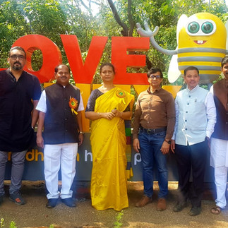
befriending bees
our team has been extensively studying bees for our upcoming project with the Maharashtra State Khadi and Village Industries Board (MSKVIB). MSKVIB's honey & beekeeping center "madhuban" in mahabaleshwar inaugurated its first step towards being the country’s first honey park.
the directorate of beekeeping in mahabaleshwar aims to spread awareness about the importance of honeybees in the ecosystem. the disheartening reality here is that not a lot of us know how significant these little wonder bees are for the human race. this center also aims to create employment opportunities in rural areas to incentivize the redundancy of urban migration. the first step towards revamping the space was developing a design to keep the pristine core intact to create a harmonized space around it. a vibrant color palette complementing substantial fabrication will synthesize modern & old architecture for an experiential walk-through along with ultra-modern technologies. infographic representations to depict how vital honeybees are put forth going around the honey park. we look forward to unfolding more chapters of this project.


back on site
the pandemic gave us a “new normal” and a “new spirit”. it was an invigorating experience for our retail team to get back on site. the team worked on the execution of the exhibition for Wipro Northwest & Wipro Garnet at Acetech 2021, Mumbai. designing a space whilst maintaining one brand identity, yet, striking a symmetrical balance between Wipro’s divisions was the vision that the team adopted.
the design was structured in a way that would create a riveting space in terms of retail design, movement, and structure. an interesting flow of path on the inside keeping monotony at a bay was inculcated with a sense of minimalism as well as vibrancy. the exterior structure, as well as the interior, were highlighted with deep grey and white letting the bright, vibrant yellow louvers stand out stronger. Wipro’s dynamic, grand, bold identity reflected in the space augmenting the dwell time effortlessly. the minimalistic typographical communication portrays simplicity within the space and allows the products to stand out. a good flow of movement and energy in the overall space to make sure the audience attains a maximum reach in terms of product visibility. our retail team looks forward to more such colossal projects ahead in the year.


For anyone worried about safety – I was too at first. What I do is scan every file before installing. Got the latest reddy anna apk, ran it through my security app, and everything came back clean. Also check the permissions it asks for. A legit app shouldn't need access to your contacts or messages. After installing, the app runs perfectly. The INR integration is smooth and the whole experience has been positive. Just take basic precautions and you'll be fine. Don't download from random shady links and you're good.
Great insights—this was a really informative and well-structured post! Goalz